Get to know with the presentations of our service for individual industries:
Loading
7/4/2023
How to increase website conversion
All postsToday, the word conversion is heard from everywhere – from bloggers to food delivery services. Let's figure out why it is needed, why it should be increased and which method is the most effective.
Simply put, the conversion is the number of target actions performed (for example, purchased goods, paid service, concluded contract). It is logical that the higher this indicator, the better it is for the entrepreneur. Therefore, everyone, from large corporations to individual entrepreneurs, is in search of effective methods to increase conversion.
What can be done? At the end of the article, the most effective way to increase conversions on the site is waiting for you.
Improve the interface
A site with a good interface is convenient to use: clear navigation, all buttons work and are in prominent places, the necessary information is easily found. All this directly affects the conversion rate.
If users do not understand what and how to do on the page, they will not be able to place an order. When a site has an unfriendly interface, the site's conversion rate may drop. As a result, they will simply go to the competitor's website, where everything is clear to them. A good example of a clear interface is the well-known marketplaces.
Work with SEO
Work on the content, invite an SEO specialist or a copywriter. High-quality interesting content and the correct use of keywords will help organically increase visitor traffic.
Do not use exclamation marks in headings
This will create a sense of compulsion for users to act or purchase and will alienate them.
Post reviews
Using reviews from social networks will increase the credibility of the company. Choose non-boring and unusual stories, they are always interesting to read.
Boost page loading
Nowadays, speed is everything. The longer the user waits for your site to load, the higher the probability that he will not wait and will go to more agile competitors. Google says that if the site loads for more than 5 seconds, the probability of failure increases significantly.
Add advanced filters
Advanced filters on the site help you find the right product or service faster. For example, if a user is looking for an analogue of some promoted product for a lower cost, by setting up filters by characteristics, he will be able to see the entire similar assortment.
Make the description clear
The description should be accessible and understandable, without ornate expressions and metaphors. Tell us how to use the product, what benefits it brings to the consumer, what are its beneficial differences from other products. If the information is really useful, it will be read in its entirety.
Use only high-quality photos and images
We live in the era of visual. Images are perceived first and only then the text. According to research, more than half of users first look at photos when they visit the page. Low-quality pictures and replicated stock photos may alienate some visitors, and they will close the site.
Create a mobile version of the site
To date, most of the purchases and orders are made by users on the go, via a smartphone. Therefore, it is very important that the mobile version of the site works correctly and quickly.
Specify prices or tariffs
Buyers are almost always interested in two questions: how much it costs, and how to buy. Give them the answer to them right away. Information about the cost should be clearly visible and transparent. Delivery options and conditions should also be described in as much detail as possible. Users will see that you have nothing to hide.
Do not allocate prices too large
It has long been proven that high prices written in small print are perceived to be lower. Also, price tags with nines are still relevant. 999 still looks cheaper than 1000. So don't discount them.
Provide online support
If the user has any questions, give him the opportunity to solve them quickly - add a chat with the operator to the site. Support should be competent and friendly.
Personalize the output
Take care of the user, analyze his behavior on the site, his previous requests, clicks. Offer something that he is really interested in. Alternatively, add a personalized block with new products or product recommendations for each specific user. This method is successfully used by almost all marketplaces.
Add incentives
The limited validity period of the offer always motivates people not to postpone the purchase. Such triggers can be messages that there are only a few products left, or there will be an additional discount on the order if the user places it in the next hour. You can also set a timer – the ticking clock will eloquently remind you that there is little time left and you need to hurry up with the purchase.
Display the download process
A very common problem is that the client has issued everything and nothing happens. He presses the buttons many times, but nothing works, eventually freaks out and leaves. No one told him that the request was being processed. Make the loading process visible, for example, by using animated elements.
Add contact information
Site visitors should see that they have come to Petya Ivanov. That's how good he is. Not a faceless something that doesn't even have a phone. Specify everything: phone numbers, addresses, links to social networks. The presence in social networks and real phones, by which a person can find out the necessary information, inspires confidence and leads to an increase in conversion.
Set up feedback
Make a feedback form and specify the recipient, for example, the founder of the company. It will also increase the level of user loyalty. After all, Petya Ivanov is not easy to find, you can still write to him about your problems, and he will definitely solve everything.
Highlight special offers
So that the user's gaze immediately catches on to them. An ideal example is a sale in online stores. There are a lot of options here: a pop-up window or a bright banner.
Use all available forms of interaction with users
• Cost Calculator — helps the client to calculate the cost of a service, for example, a mortgage loan or car leasing;
• Pop-ups — a pop-up window with useful information and a call to action;
• Quiz — test or quiz, with which you can, for example, explain how the product works, help the user with the choice of services;
• Mini-games – the buyer goes through one or two simple rounds of your game, and at the end, of course, he will be rewarded with a promo code or some other bonus that will make him return to your site again and make a purchase. A successful example is the Scooter delivery service.
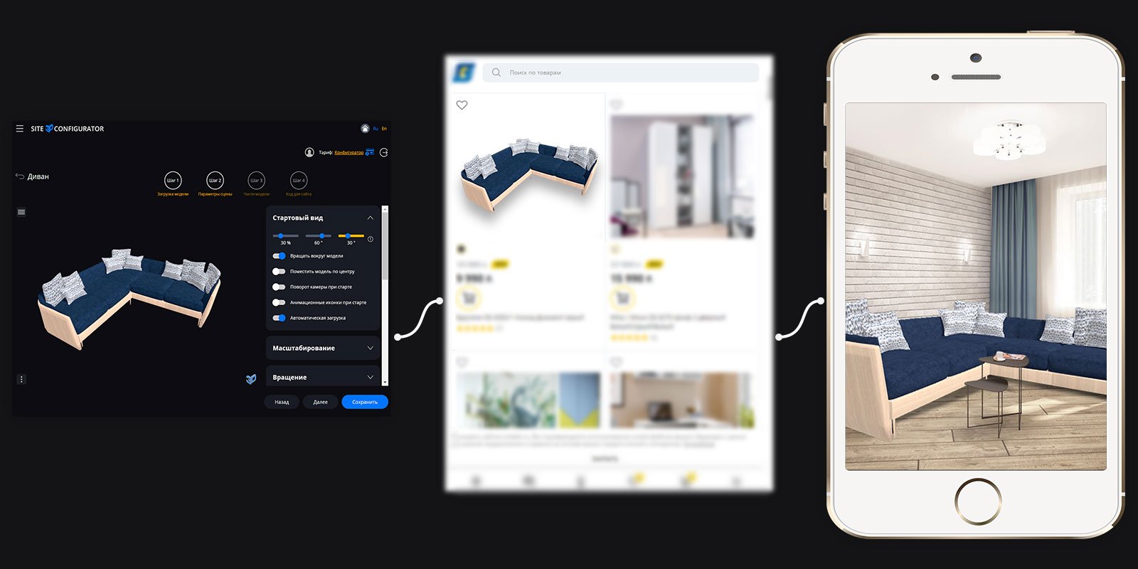
Introduce new technologies
Use 3D models, elements of virtual and augmented reality. This will favorably distinguish you from competitors, simplify the purchase for users and, as a result, increase conversion.
According to Columbus, using 3D models instead of 2D images increases the average online sales receipt by 30%, and showing customers exactly what they receive reduces online refunds by 80%.
Plus, users are willing to share interesting novelties with each other, this will increase awareness of your company in a natural way. According to Gardner surveys, interactive 3D generates 40% more conversions than traditional marketing in 2020.
An excellent example of a domestic service for the introduction of interactive 3D models on websites is Site3D Configurator. With it, your customers will be able to change the appearance and configuration of your products directly on the website and send their choice to managers, optimizing their work.